다양한 배경 속성들
#background
1. background-color
요소의 배경 색상을 결정함(transparent,색상 등이 속성으로 들어감)
2. background
배경을 넣을 수 있는 속성으로 뒤에는 주로 함수가 들어감.
#. linear-gradient()
색상이 두가지 일때 : 상하로 색 2개 지정
방향과 색상 두가지 : 해당 방향으로 그라데이션을 만듬
방향|색상|색상1의 비중|색상2 : 색상1의 비중이 지정값인 그라데이션
방향|색상1|색상2|색상3 : 색상을 3개 사용한 그라데이션
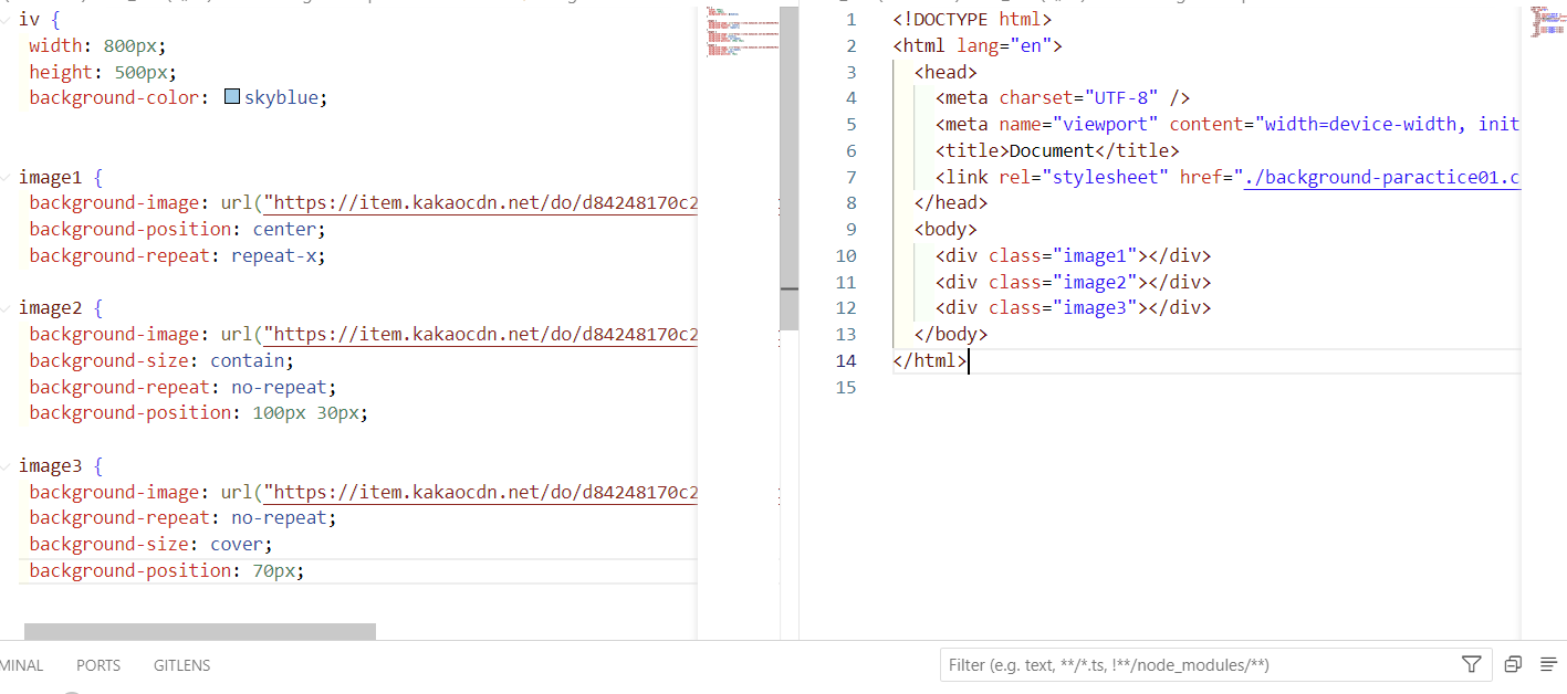
3. background-image
이미지가 없는 게 default
url("경로") -> 이미지 경로
단, 이미지 설정값이 테그의 크기보다 작을 경우 반복출력
4. background-repeat
repeat(이미지를 수직, 수평 반복)
repeat-x,repeat-y : 이미지를 해당 축으로 반복
no-repeat : 반복 없음
5. background-position
0%~100% 사이의 값
top, bottom과 같은 방향을 지시하는 단어
px,em,rem과 같은 x축, y축의 값
6. background-size
auto(이미지의 실제크기,기본값)
단위(가로, 세로)
cover(비율을 유지 요소의 더 넓은 너비에 맞춤)
contain(비율을 유지, 요소의 더 짧은 너비에 맞춤)
7. background-attactment
scroll(이미지가 요소를 따라서 같이 스크롤)
fixed(이미지가 뷰포트에 고정, 스크롤 X)
local(요소 내 스크롤 시 이미지가 같이 스크롤)
display 설정

inline-block, block, asolute 외에도 flex라는 옵션이 있음
주로 특정 컨테이너에 items를 쌓아주는 용도로 부모 테그에 사용함.
flex와 관련된 세부 옵션
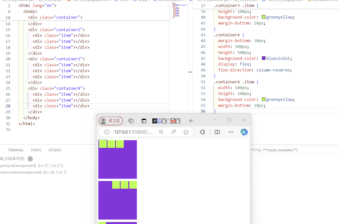
1. flex-direction : flex의 item들이 쌓이는 방향을 지정하는 속성
row(행 축(좌 => 우))
row-reverse(행 축(우 => 좌))
column(열 축(위 => 아래))
column-reverse(열 축(아래 => 위))
2. flex-wrap : flex ltems가 브라우저를 넘어갈 경우, 줄바꿈을 할 것인가? 안하면 item이 찌그러져 나타남.
wrap : flex 설정이 되어 있는 부모의 크기를 넘어갈 경우, 줄바꿈을 한다.
wrap-reverse : 줄바꿈을 하되, 쌓이는 방향이 반대가 된다.
nowrap : 줄바꿈을 하지 않고, 자식 테그를 찌그러뜨려 우겨넣는 느낌?
3. justify-content : 주 축의 정렬 방법
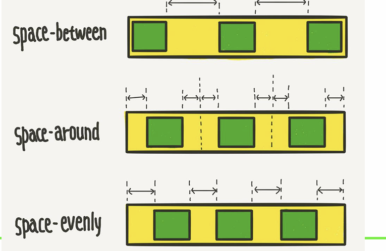
flex-start : flex-ltems를 시작점으로 정렬
flex-end : flex-ltems를 끝점으로 정렬
center : flex-items를 가운데 정렬
space-between : 각 flex items 사이를 균등하게 정렬
space-around : 각 flex items의 외부 여백을 균등하게 정렬
space-evenly : 각 아이템간의 외부 여백과 사이를 균등하게 정렬
4. align-items : 교차 축의 한 줄 정렬 방법
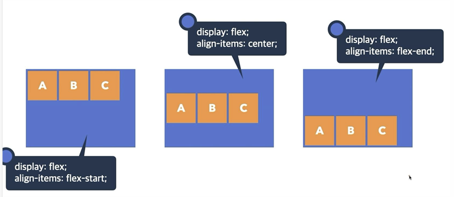
stretch : flex items를 교차 축으로 늘림(기본 값)
flex-start : flex items를 각 줄의 시작점으로 정렬
flex-end : flex items를 각 줄의 끝점으로 정렬
center : flex items를 각 줄의 가운데 정렬
baseline : flex items를 각 줄의 문자 기준선에 정렬
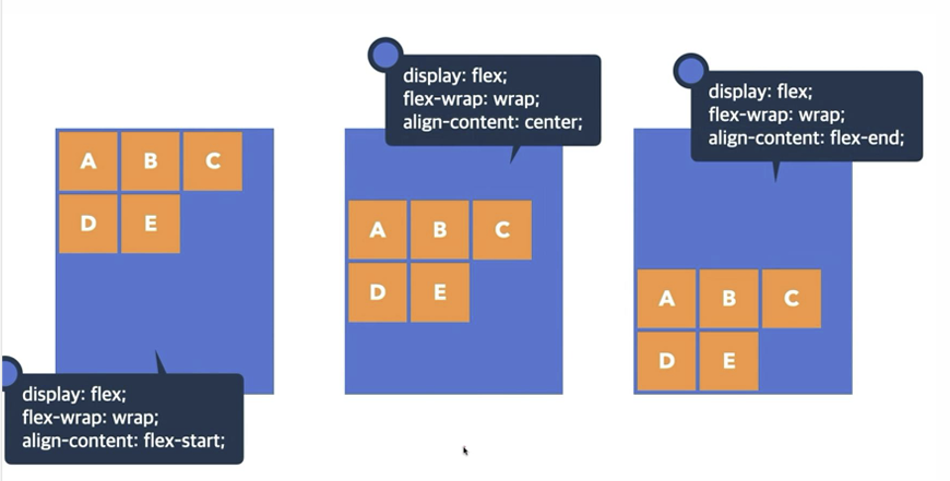
5. align-content : 교차 축의 여러 줄 정렬 방법
stretch : flex items를 시작점으로 정렬(기본 값)
flex-start : flex items를 시작점으로 정렬
flex-end : flex items를 끝점으로 정렬
center : flex items를 가운데 정렬
space-between : 각 flex items 사이를 균등하게 정렬
space-around : 각 flex items의 외부 여백을 균등하게 정렬
#####실습문제 1#####
#######실습문제2#######
##########실습문제3##############
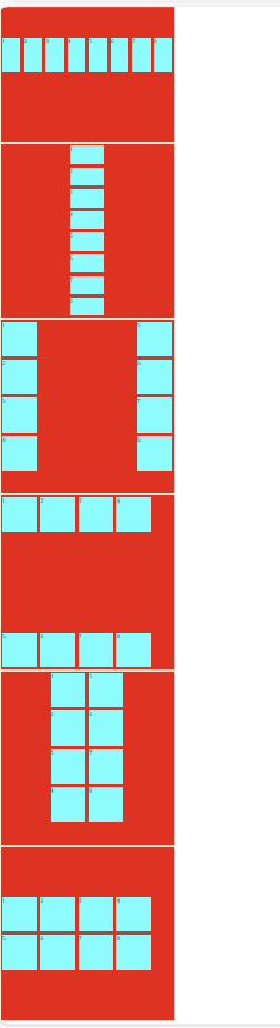
.container1 {
  width: 500px;
  height: 500px;
  border: 1px solid blanchedalmond;
  background-color: red;
  display: flex;
  flex-wrap: nowrap;
  flex-direction: row;
  align-items: center;
}
div .item {
  width: 100px;
  height: 100px;
  background-color: aqua;
  margin: 5px;
  line-height: 100px;
  text-align: center;
}
.container2 {
  width: 500px;
  height: 500px;
  border: 1px solid blanchedalmond;
  background-color: red;
  display: flex;
  flex-wrap: nowrap;
  flex-direction: column;
  align-items: center;
}
.container3 {
  width: 500px;
  height: 500px;
  border: 1px solid blanchedalmond;
  background-color: red;
  display: flex;
  flex-wrap: wrap;
  flex-direction: column;
  align-content: space-between;
}

.container4 {
  width: 500px;
  height: 500px;
  border: 1px solid blanchedalmond;
  background-color: red;
  display: flex;
  flex-wrap: wrap;
  flex-direction: row;
  align-content: space-between;
}

.container5 {
  width: 500px;
  height: 500px;
  border: 1px solid blanchedalmond;
  background-color: red;
  display: flex;
  flex-wrap: wrap;
  flex-direction: column;
  align-content: center;
  justify-content: center;
}
.container6 {
  width: 500px;
  height: 500px;
  border: 1px solid blanchedalmond;
  background-color: red;
  display: flex;
  flex-wrap: wrap;
  flex-direction: row;
  align-content: center;
  justify-content: center;
}
느낀점 : 중복으로 들어간 부분을 줄여야 한다. 무조건 문제가 있다고 짜기 부터 하는 게 아니라, 공통으로 포함되는 부분을 생각하는데 집중해야 겠다.
'KDT 코딩온 개발 14기 수강일기' 카테고리의 다른 글
| KDT 포스코X코딩온 웹 과정 14기 9일 - 반응형 웹 (0) | 2024.09.20 |
|---|---|
| KDT 포스코X코딩온 웹 과정 14기 7일~8일 - CSS 특수효과 (1) | 2024.09.12 |
| KDT 포스코X코딩온 웹 과정 14기 5~6일 : position, z-index (0) | 2024.09.10 |
| KDT 포스코X코딩온 웹 과정 14기 4,5일차- 속성 (0) | 2024.09.09 |
| KDT 포스코X코딩온 웹 과정 14기 - 3,4일차 CSS 선택자 (0) | 2024.09.07 |